What Makes a High-CTR Thumbnail
A practical guide to mobile readability, focal clarity, contrast, expectation match, and click motivation for YouTube thumbnails.
Direct answer
A high-CTR thumbnail usually makes the topic clear fast, gives the eye one obvious focal point, reads well on mobile, creates curiosity without misleading the viewer, and matches the title promise. No single visual trick guarantees CTR.
Key takeaways
- Good thumbnails are clear before they are clever.
- Mobile readability and focal clarity are repeatable checks.
- CTR should not come from misleading the viewer.
High-CTR thumbnail signals
| Signal | Good version | Weak version |
|---|---|---|
| Focus | One clear subject | Several competing elements |
| Text | Short and readable | Too many small words |
| Contrast | Subject separates from background | Flat or muddy values |
| Promise | Matches the video idea | Creates a clickbait mismatch |
Start with clarity
A viewer should understand the core idea in less than a second. If the image needs explanation, it is probably too complex for a feed.
Clear does not mean boring. It means the visual hierarchy does not fight itself.
Design for mobile first
Many thumbnails fail because they look good at design-canvas size and collapse in a mobile feed.
Shrink the image and check whether the subject, text, and emotional cue are still readable.
Match the promise
A thumbnail can win a click and still hurt the video if it attracts the wrong expectation.
The best thumbnail makes the right viewer curious about the actual video, which supports both CTR and retention.
Clarity beats visual noise
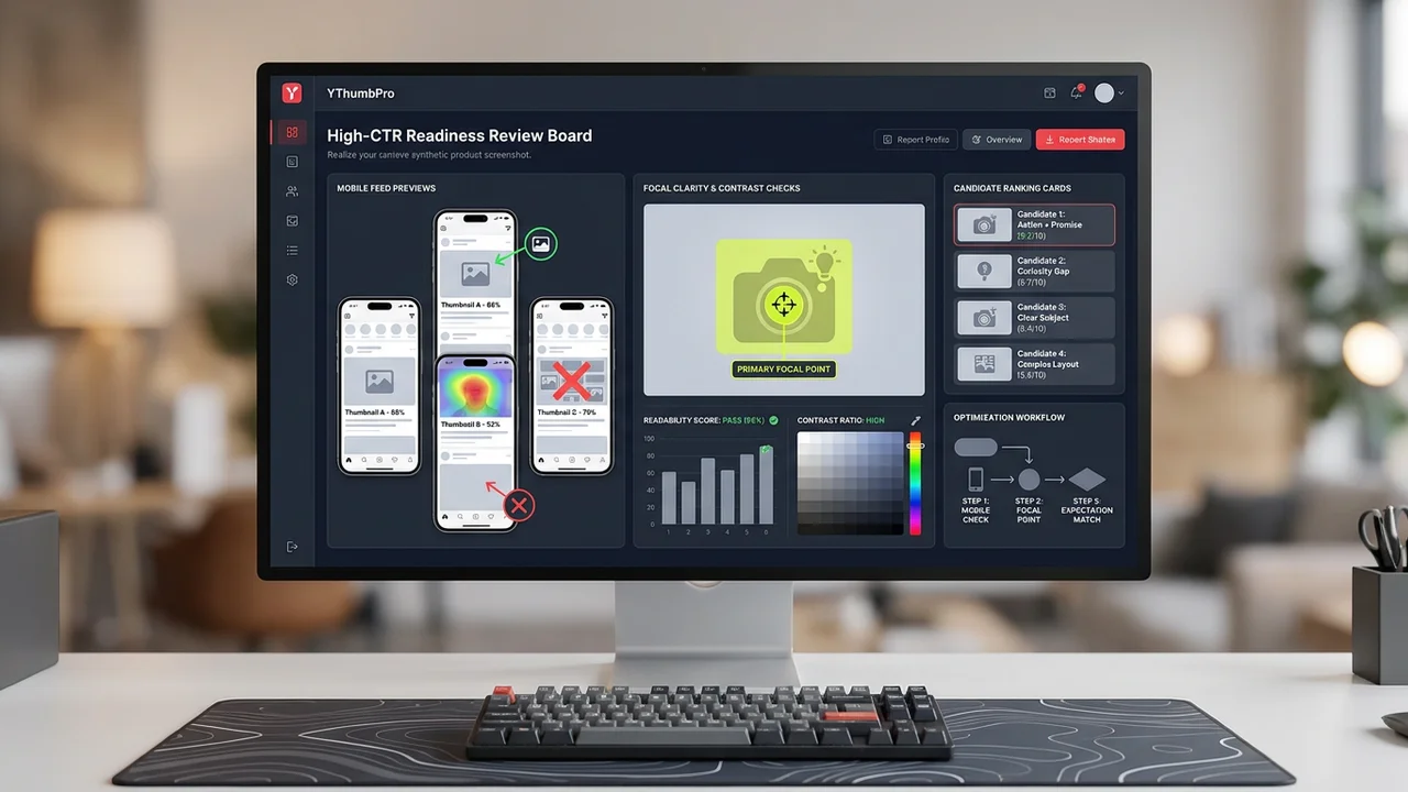
A strong YouTube thumbnail is usually understandable before it is admired. The viewer should know where to look and what the video is broadly about in less than a second. If the image requires careful study, it is likely too complex for a recommendation feed.
Clarity starts with one dominant focal point. That can be a face, object, before-and-after result, product, scene, or visual conflict. Supporting elements should help the focal point, not compete with it.
This is why many high-performing thumbnails look simpler than the design file behind them. The creator may have tested many details, but the final image gives the viewer a fast path through the composition.
Mobile readability changes the design
A thumbnail that looks polished at full size can fail at mobile feed size. Text becomes smaller, subtle contrast disappears, and background details can merge into the subject. The only reliable check is to shrink the image and judge it quickly.
Use fewer words, larger type, strong subject separation, and a clear emotional or informational cue. If the title already carries the nuance, the thumbnail does not need to repeat every detail.
YThumbPro's methodology treats mobile readability as a high-weight signal because it is one of the easiest problems to see and fix before publishing.
Expectation match protects retention
CTR is not the only goal. A thumbnail that creates the wrong expectation may win clicks and then lose viewers quickly. That can hurt the video's overall performance because the viewer did not get what the image promised.
A better thumbnail attracts the right viewer. It creates curiosity or urgency while still matching the video topic, title, and payoff. Honest specificity often beats vague drama.
When using AI analysis, read the expectation-match notes carefully. A suggestion that improves click motivation should still respect the actual content of the video.
Contrast should guide attention
Contrast is useful because it separates the focal point from the background and helps the image survive compression. But contrast is not only about bright colors. It can come from value, size, focus, expression, shape, or context.
A thumbnail with too many high-contrast elements can become noisy. The goal is to make the right element stand out, not to make every element loud.
For competitor research, note how similar channels use contrast. Some niches favor clean product contrast; others rely on expressive faces or clear before-and-after structure. Use the pattern, then build an original thumbnail.
Use CTR signals as a checklist, not a formula
There is no universal formula for a high-CTR thumbnail. Niche, topic, audience, title, traffic source, timing, and video quality all matter. A design that works for one channel may feel misleading or off-brand for another.
A practical checklist is safer: one focal point, readable mobile text, strong subject separation, honest title match, and a clear reason to click. Use this checklist before publishing and again when reviewing old videos for refresh opportunities.
YThumbPro's CTR glossary and analyzer connect this article to action. The glossary defines CTR clearly, while the analyzer helps turn the checklist into a specific revision plan.
Balance CTR with viewer satisfaction
A thumbnail can raise CTR for the wrong reason. If the image exaggerates the payoff or implies something the video does not deliver, viewers may click and leave quickly. That can weaken the video even when the initial click looks attractive.
The better goal is qualified curiosity. The thumbnail should make the right viewer want the actual video. This is why expectation match belongs beside readability and contrast in the checklist.
When refreshing old thumbnails, review retention and comments as well as CTR. A thumbnail that attracts fewer but better-matched viewers can be healthier than one that creates a short-lived click spike.
How to use AI without chasing a magic score
Use the analyzer to identify the weakest visual signal, then make one focused edit. If you change text, face crop, background, color, and title all at once, it becomes harder to learn which change helped.
Compare the reasoning behind two analyses, not only the total score. The note that explains why mobile readability improved is often more useful than a small numeric difference.
This article links to the CTR glossary and A/B testing guide because high-CTR work is a loop: define the metric, improve the visible candidate, compare alternatives, and validate the result with real performance data.
Thumbnail signals by creator workflow
For a new upload, prioritize clarity and title match before publishing. For an underperforming old video, compare the old thumbnail against the current title, search intent, and competing videos. For a client audit, document the repeated weak signals across multiple uploads.
Different workflows need different evidence. A designer may need specific crop notes, a channel manager may need performance context, and a founder reviewing a channel may need a fast list of likely refresh opportunities.
YThumbPro's public content is structured to serve all three without overpromising. The analyzer gives directional feedback, the methodology explains the criteria, and the landing pages give users a path into the product.
The role of the title
A thumbnail does not work alone. The title tells the viewer what the video promises; the thumbnail makes that promise visible and emotionally legible. If the two fight each other, CTR and retention can both suffer.
When reviewing a thumbnail, always read the title beside it. A clear image with a vague title may not earn the click. A strong title with a confusing image may create hesitation. The best pair feels like one promise.
YThumbPro analysis should therefore be used with context. A thumbnail candidate can look strong in isolation and still need changes once the title and topic are known.
Niche expectations change the answer
Gaming, finance, cooking, education, tech reviews, and creator commentary often use different thumbnail conventions. Some niches reward expressive faces; others reward product clarity, charts, results, or simple before-and-after evidence.
Competitor research helps identify these norms. The goal is not to copy them blindly, but to understand the visual language viewers already recognize in that category.
A high-CTR checklist should be adapted to the niche. Mobile readability and expectation match matter everywhere, but the best focal point and emotional cue may differ by audience.
Refresh old thumbnails with evidence
Old videos can benefit from thumbnail refreshes, especially when impressions exist but CTR is weak. Start by comparing the current thumbnail against the title, top competitors, and the mobile readability checklist.
Make one focused change at a time when possible. If you change the title, thumbnail, and description together, it becomes harder to understand what moved performance.
After refreshing, give the video enough impressions before judging. The goal is a better qualified click, not a quick visual change that cannot be measured.
A practical review rubric
Use a five-question rubric before publishing: Can a viewer identify the subject instantly? Does the text survive mobile size? Does the subject separate from the background? Does the image match the title promise? Is there a specific reason to click?
Score each question with simple labels such as clear, mixed, or weak. This keeps the review focused on observable quality instead of taste. A thumbnail with two weak labels deserves another design pass before it receives real impressions.
The rubric also helps teams discuss thumbnails without turning every review into subjective preference. Designers can revise the weak signal, channel managers can compare candidates, and creators can keep the final decision tied to the video's actual promise.
What to do after the video is live
After publishing, compare the rubric with real data. If impressions are strong but CTR is weak, revisit readability, focal clarity, and title match. If CTR is strong but retention drops quickly, the thumbnail may be attracting the wrong expectation.
When refreshing, avoid changing everything at once unless the old packaging is clearly broken. A focused refresh creates cleaner learning and makes it easier to decide whether the new thumbnail should become part of your channel style.
This closes the loop between SEO content and product use: learn the rubric, analyze a candidate, publish or refresh, then use performance data to make the next thumbnail smarter.
Use the checklist during creative review
During a team review, ask everyone to judge the thumbnail at small size first. Full-size review encourages people to debate details viewers may never notice. Small-size review keeps the conversation focused on the real click environment.
Then ask whether the thumbnail and title create one coherent promise. If reviewers describe different video expectations, the packaging is probably unclear. The fix may be a simpler thumbnail, a sharper title, or a better match between the two.
Finally, record the chosen reason for the design. A short note such as clearer result image or stronger face emotion makes later performance review more useful than a vague note that the team liked version B.
Next action
Turn this research into a repeatable thumbnail workflow
When thumbnail review becomes part of your publishing routine, compare the plan that matches saved history, repeated analysis, and testing needs.
Step-by-step guide
- 1
Shrink the image
Preview it at mobile size.
- 2
Name the focal point
Check whether one subject clearly wins attention.
- 3
Read the text fast
Remove or enlarge words that do not survive small sizes.
- 4
Compare with the title
Make sure the thumbnail promise matches the video.
Frequently asked questions
What is a good thumbnail CTR?
It varies by niche, traffic source, and video type. Compare against your own channel and similar content rather than a universal number.
Does more contrast always improve CTR?
No. Contrast helps readability, but the image still needs a clear subject and honest promise.
Can AI tell me if a thumbnail is high CTR?
AI can review readiness signals, but real CTR comes from YouTube impressions and viewer behavior.