YouTube Thumbnail Fonts: What Works Best in 2026
The right font can dramatically improve your thumbnail's click-through rate. Explore the best fonts for YouTube thumbnails in 2026, with pairing strategies and readability tips.
YouTube Thumbnail Fonts: What Works Best in 2026
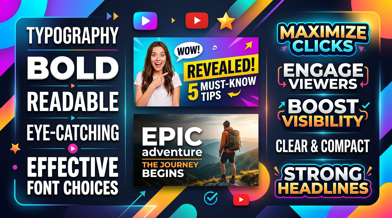
Typography might seem like a minor detail, but font choice significantly impacts thumbnail effectiveness. The right font communicates professionalism, enhances readability, and reinforces your brand identity. In 2026, thumbnail typography trends continue to favor bold simplicity over decorative complexity.
Why Font Selection Matters
Instant Readability
Viewers scroll through feeds rapidly. Your text has less than a second to communicate. Fonts that require cognitive effort to decipher cause viewers to scroll past.
Brand Recognition
Consistent typography builds visual identity. When viewers recognize your font style, they recognize your content, creating trust and expectation.
Emotional Communication
Fonts carry personality. Bold, heavy fonts suggest strength and excitement. Light, clean fonts suggest elegance and professionalism. Your font choice should match your content's emotional tone.
The Best Thumbnail Fonts for 2026
Impact
Style: Bold, condensed sans-serif Best For: Gaming, entertainment, high-energy content Why It Works: Maximum impact in minimal space. Letters remain legible even at small sizes.
Pairing Suggestion: Use Impact for headlines with a cleaner sans-serif for any secondary text.
Bebas Neue
Style: Tall, narrow sans-serif Best For: Fashion, lifestyle, modern content Why It Works: Elegant yet bold. Creates sophisticated impression while maintaining strong presence.
Pairing Suggestion: Excellent as a standalone font. If pairing needed, use with rounded sans-serifs.
Montserrat
Style: Geometric sans-serif with multiple weights Best For: Professional content, tutorials, business Why It Works: Versatile and modern. Available in many weights for hierarchy without changing font families.
Pairing Suggestion: Use bold weights for headlines and regular weights for supporting text.
Roboto
Style: Friendly, modern sans-serif Best For: Tech content, tutorials, educational material Why It Works: Familiar and trustworthy. Google's signature font feels contemporary without being trendy.
Pairing Suggestion: Pairs well with virtually any other font due to its neutral personality.
Oswald
Style: Condensed, gothic-inspired sans-serif Best For: Sports, gaming, bold statements Why It Works: Strong vertical emphasis creates dramatic impact. Excellent for limited horizontal space.
Pairing Suggestion: Pair with wider sans-serifs to create contrast in letter proportions.
Antonio
Style: Extended sans-serif Best For: Modern brands, tech content, minimalist designs Why It Works: Wide letter spacing creates contemporary feel. Excellent for short, impactful words.
Pairing Suggestion: Best used alone for maximum effect. Avoid combining with other wide fonts.
Poppins
Style: Geometric sans-serif with rounded features Best For: Friendly content, children's channels, lifestyle Why It Works: Approachable and modern. Rounded elements feel welcoming without sacrificing legibility.
Pairing Suggestion: Combine bold weights for headlines with regular weights for supporting text.
Raleway
Style: Elegant sans-serif with variation in stroke width Best For: Lifestyle, fashion, sophisticated content Why It Works: Refined appearance elevates perceived quality. Excellent for channels targeting design-conscious audiences.
Pairing Suggestion: Use thin weights for elegant designs, bold weights for stronger presence.
Font Pairing Principles
Contrast Creates Interest
Pair fonts that differ significantly:
- Bold with light weights
- Condensed with extended styles
- Tall with short x-heights
Limit to Two Fonts
More than two fonts creates visual chaos. If you need variety, use different weights of the same font family rather than introducing new typefaces.
Hierarchy Through Weight
Establish clear hierarchy using:
- Bold for primary information
- Regular for secondary information
- Light for subtle details
Font Sizing Guidelines
Primary Text
Your main text should dominate the thumbnail. For standard 1280x720 thumbnails:
- Minimum: 80px
- Recommended: 120-180px
- Maximum: 240px
Secondary Text
Supporting text should complement without competing:
- Minimum: 60px
- Recommended: 80-100px
- Maximum: 120px
The Mobile Test
Always verify text size at mobile preview dimensions. What seems appropriately sized on a large monitor may disappear on phone screens.
Text Color Strategies
High Contrast Combinations
Maximum readability options:
- White text on dark backgrounds
- Black text on light backgrounds
- Yellow text on blue backgrounds
- Red text on white backgrounds
Text Shadow Technique
Adding shadows ensures readability against any background:
- Dark shadows behind light text
- Light glow behind dark text
- Subtle shadows avoid looking amateurish
Background Blocking
Place solid color shapes behind text for guaranteed readability:
- Semi-transparent rectangles
- Solid color banners
- Gradient overlays
Typography Mistakes to Avoid
Using Too Many Fonts
Each additional font dilutes your visual identity. Stick to one primary font with occasional secondary support.
Choosing Style Over Readability
Decorative fonts might look interesting but fail at thumbnail sizes. Prioritize clarity over creativity.
Inconsistent Font Usage
Random font changes across thumbnails confuse viewers. Maintain consistency to build recognition.
Ignoring Kerning
Letter spacing affects readability. Tight kerning can cause letters to blend; loose kerning can make words hard to read.
Text Too Small
When in doubt, make text larger. Small text that's unreadable on mobile wastes thumbnail real estate.
Genre-Specific Font Recommendations
Gaming
Primary: Impact, Oswald, Antonio Characteristics: Bold, condensed, high impact Color Approach: Bright, saturated colors with heavy outlines
Educational/Tutorials
Primary: Montserrat, Roboto, Poppins Characteristics: Clean, professional, approachable Color Approach: High contrast with subtle effects
Lifestyle/Vlog
Primary: Bebas Neue, Raleway, Poppins Characteristics: Modern, friendly, relatable Color Approach: Warm tones with clean presentation
Tech/Review
Primary: Roboto, Montserrat, Antonio Characteristics: Technical, precise, modern Color Approach: Clean contrasts, minimal effects
Entertainment
Primary: Impact, Oswald, Bebas Neue Characteristics: Bold, attention-grabbing, fun Color Approach: Vibrant colors with strong outlines
Creating Font Hierarchy
Level 1: Hook (Largest)
Your primary message—3 words maximum:
- Largest size
- Bold weight
- Highest contrast
Level 2: Context (Medium)
Additional information if needed:
- 60-70% of hook size
- Regular or medium weight
- Lower contrast or supporting color
Level 3: Brand (Smallest)
Channel name or logo text:
- Consistent across all thumbnails
- 40-50% of hook size
- Subtle presence, not competing
Font Licensing Considerations
Free for Commercial Use
The fonts listed above are available through Google Fonts, making them free for commercial use including YouTube thumbnails.
Premium Fonts
Consider investing in premium fonts if:
- Your channel generates significant revenue
- Brand uniqueness is crucial
- You need features unavailable in free options
Avoiding Copyright Issues
Always verify font licensing before use. Many fonts require licenses for commercial applications, including YouTube thumbnails.
Testing Your Font Choices
Readability Test
Show your thumbnail to someone unfamiliar with your content. Can they read the text instantly without effort?
Mobile Test
View your thumbnail on an actual mobile device. Does the text remain clear and legible?
Competition Test
Compare your thumbnail to successful competitors. Does your text stand out while remaining readable?
Conclusion: Typography as Brand Asset
Your font choice is a long-term brand decision. Select fonts that represent your content's personality and maintain consistency across all thumbnails. The investment in finding the right typography pays dividends through improved recognition and click-through rates.
Start with the fonts recommended for your genre, then test variations with your audience. Over time, you'll develop an instinctive sense for what typography works best for your specific content.
Remember: The best font is one viewers can read instantly without thinking about it. Complexity that hinders readability undermines your thumbnail's purpose.
jackyi
YouTube content strategist and thumbnail optimization expert. Passionate about helping creators grow their channels through data-driven design and SEO best practices.