YouTube Shorts Thumbnails: How to Optimize for Vertical Video Success
Master the art of creating compelling YouTube Shorts thumbnails that drive views in the vertical format. Learn design principles, text placement strategies, and mobile-first optimization techniques.
YouTube Shorts Thumbnails: How to Optimize for Vertical Video Success
YouTube Shorts has fundamentally changed how viewers discover and consume content. With over 70 billion daily views globally, Shorts represents a massive opportunity for creators. But here's what most creators miss: Shorts thumbnails require an entirely different approach than traditional horizontal videos.
This comprehensive guide reveals the specific strategies that make Shorts thumbnails effective in the vertical format, helping you stand out in an increasingly crowded space.
Why Shorts Thumbnails Are Different
The Vertical Paradigm Shift
Traditional YouTube thumbnails follow a 16:9 horizontal format. Shorts flip this entirely with a 9:16 vertical orientation. This isn't just a rotation—it fundamentally changes how you compose, place elements, and guide the viewer's eye.
Vertical space creates a natural top-to-bottom scanning pattern. Western viewers read from top to bottom, making this format intuitively comfortable. Your thumbnail must leverage this natural flow rather than fight against it.
Mobile-First Reality
Shorts are consumed almost exclusively on mobile devices. Your thumbnail appears as a small vertical card in a scrolling feed, competing with dozens of other Shorts for attention. The viewing context demands instant clarity and immediate impact.
Unlike horizontal thumbnails that viewers might study for a second or two, Shorts thumbnails get a fraction of a second to make an impression. Every element must work harder to communicate value.
Feed Integration Challenges
Shorts thumbnails appear in multiple contexts: the Shorts shelf, channel pages, search results, and the dedicated Shorts tab. Each context displays your thumbnail differently, requiring designs that work across all scenarios.
Essential Design Principles for Vertical Thumbnails
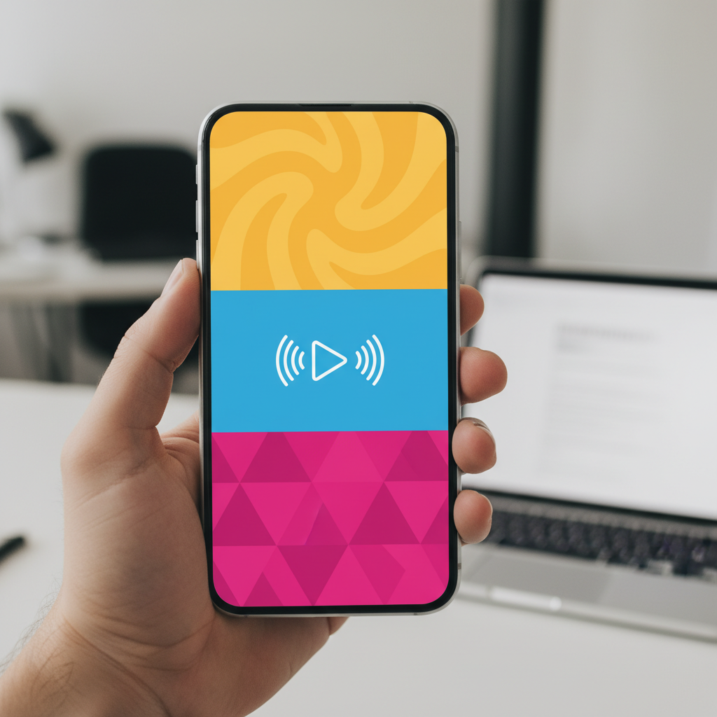
The Three-Zone Framework
Effective Shorts thumbnails follow a three-zone structure that guides viewer attention naturally:
Zone 1: Hook (Top Third) The top third of your thumbnail is prime real estate. This zone captures initial attention and should contain your most compelling element—typically a face with strong expression or a provocative question.
Zone 2: Context (Middle Third) The middle third provides context about your content. This is where supporting visuals, key objects, or secondary information appear. Think of it as the bridge between hook and payoff.
Zone 3: Payoff (Bottom Third) The bottom third delivers the promise or outcome. Show results, conclusions, or the destination of your content journey. This zone creates anticipation that drives clicks.
Text Placement Strategies
Text in vertical thumbnails requires careful consideration:
Top Placement: Ideal for questions, hooks, or provocative statements. Text at the top catches attention as viewers scroll vertically through their feed.
Middle Placement: Works well for labels, categories, or supporting information. Middle text doesn't compete with the hook but adds context.
Bottom Placement: Effective for outcomes, results, or conclusions. Viewers naturally scroll to see what's at the bottom, creating engagement.
Text Sizing: Unlike horizontal thumbnails where text spans the width, vertical thumbnails allow for larger, more impactful text. A single word can fill significant vertical space, creating dramatic emphasis.
Safe Zone Considerations
YouTube overlays interface elements on Shorts thumbnails:
- Channel name and verification badge (bottom left)
- View count and engagement metrics (bottom)
- Action buttons (right side)
Design your thumbnails keeping these overlays in mind. Avoid placing critical information in areas that will be covered by interface elements.
Visual Elements That Work in Vertical
Faces and Expressions
Human faces remain powerful attention magnets in vertical format. However, composition changes:
Full Face vs. Cropped: Unlike horizontal thumbnails where faces are often cropped for drama, vertical format allows complete faces with room for expression. Consider showing the full face in the top third for maximum emotional connection.
Eye-Level Composition: Position eyes in the upper third of the frame. This placement creates direct eye contact with viewers scrolling through their feed.
Expression Amplification: Vertical space allows for more dramatic expressions. A surprised face can show not just the expression but body language that reinforces the emotion.
Objects and Products
Product-focused Shorts benefit from vertical composition:
Vertical Products: Items that naturally orient vertically (phones, bottles, tall objects) fit perfectly in the format. Align these naturally with the frame.
Stacked Arrangements: Vertical space allows for stacked or tiered arrangements of multiple items, creating visual progression and depth.
Scale Emphasis: The tall format emphasizes height and scale. Show products from top to bottom to communicate full size and presence.
Action and Movement
Vertical format excels at capturing vertical motion:
Falling/Dropping: Content involving falling objects, dropping items, or downward motion gains natural emphasis.
Rising/Growing: Upward movement, growth, or progression tells a compelling story from bottom to top.
Before/After Stacks: Vertical split-screen comparisons work exceptionally well, with "before" on top and "after" below, following natural reading patterns.
Text and Typography Optimization
Font Selection for Mobile
Mobile readability demands specific typography choices:
Bold, Sans-Serif Fonts: Thin or decorative fonts become illegible at mobile sizes. Choose fonts like Impact, Bebas Neue, or bold weights of popular sans-serifs.
Stroke and Shadow: Add text stroke or shadow to ensure readability against any background. High contrast between text and background is non-negotiable.
Letter Spacing: Slightly increased letter spacing improves readability on small mobile screens. Tight spacing creates visual crowding.
Text Quantity Guidelines
Vertical thumbnails handle text differently than horizontal:
Maximum Words: Limit to 2-4 words. The vertical format doesn't reward extensive text—viewers won't read it.
Word Stacking: Instead of horizontal text lines, stack words vertically. This utilizes the format while maintaining readability.
Single Word Impact: A single large word can dominate the entire thumbnail height, creating dramatic emphasis impossible in horizontal format.
Color and Contrast
Mobile screens present unique color challenges:
High Saturation: Mobile screens render colors more vividly. Slightly desaturate extreme colors to prevent harshness.
Contrast Amplification: Outdoor viewing requires higher contrast than desktop viewing. Increase contrast by 15-20% beyond what looks good on your monitor.
Background Simplicity: Complex backgrounds reduce text legibility on mobile. Use solid colors, simple gradients, or heavily blurred backgrounds.
Content-Specific Strategies
Tutorial and How-To Shorts
Educational Shorts thumbnails should communicate clear outcomes:
Before/After Focus: Show the transformation prominently. The vertical format naturally presents before (top) and after (bottom).
Step Indicators: Number your steps vertically. "Step 1" at top, "Step 2" in middle, etc., creates a clear sequence.
Result Emphasis: Place the final result prominently, either as the main hook or in the payoff zone.
Entertainment and Reaction Shorts
Entertainment content relies on emotional impact:
Expression Dominance: Let exaggerated expressions fill significant thumbnail space. The face should be the primary element.
Reaction Context: Show what caused the reaction without revealing everything. Create curiosity about the stimulus.
Energy Visualization: Use visual elements that convey energy—motion lines, impact effects, or dynamic backgrounds.
Product and Review Shorts
Product content needs clarity and appeal:
Product Prominence: The product should occupy significant vertical space. Don't shrink products to fit horizontal composition habits.
Rating Visuals: Use vertical rating indicators (5 stars stacked, progress bars) that utilize the format.
Price/Value Placement: Position pricing or value propositions in the payoff zone to create action motivation.
Technical Specifications
Resolution and Quality
Recommended Resolution: 1080 x 1920 pixels (9:16 aspect ratio) Minimum Resolution: 720 x 1280 pixels File Size: Keep under 2MB for optimal loading Format: PNG for graphics, JPEG for photographs
Safe Zone Measurements
YouTube recommends keeping critical elements within these boundaries:
- Top: 50 pixels from edge
- Bottom: 200 pixels from edge (interface overlay area)
- Sides: 50 pixels from edges
Export Settings
When exporting Shorts thumbnails:
- Color Space: sRGB for web consistency
- Compression: Medium to high quality (80-90% for JPEG)
- Sharpening: Apply slight sharpening for mobile clarity
Testing and Optimization
A/B Testing for Shorts
YouTube's A/B testing works for Shorts thumbnails. Test these variables specifically:
Expression Variations: Test different facial expressions in the hook zone. Text Placement: Compare top vs. middle vs. bottom text positioning. Color Schemes: Test different background colors for feed visibility. Element Hierarchy: Experiment with which elements dominate the frame.
Analytics Specific to Shorts
Monitor these Shorts-specific metrics:
Swipe-Away Rate: High swipe-aways suggest thumbnails don't match content or fail to deliver on promises.
Average View Duration: For Shorts, even a few seconds of average view duration matters. Thumbnails should accurately represent content length and nature.
Shorts Shelf Performance: Track how your Shorts perform when appearing in the Shorts shelf versus other discovery methods.
Common Shorts Thumbnail Mistakes
Horizontal Thinking in Vertical Format
Many creators simply crop horizontal thumbnails to vertical. This mistake:
- Cuts off important elements
- Creates awkward compositions
- Wastes vertical space
Solution: Design specifically for vertical from the start. Don't adapt horizontal designs.
Overcrowding the Frame
Vertical thumbnails tempt creators to fill all the space. This creates:
- Visual confusion
- Unclear hierarchy
- Mobile unreadability
Solution: Embrace white space. Let key elements breathe. Less is more in mobile-first viewing.
Ignoring Interface Overlays
Critical information hidden by YouTube's interface:
- Text covered by view counts
- Faces obscured by action buttons
- Products blocked by channel information
Solution: Design with overlays in mind. Test how your thumbnail appears with interface elements present.
Inconsistent Vertical Branding
Mixing horizontal and vertical styles inconsistently:
- Confuses channel identity
- Reduces recognition
- Weakens brand impact
Solution: Develop specific vertical branding guidelines for Shorts content.
Building a Shorts Thumbnail Workflow
Template Creation
Create reusable templates for different Short types:
Tutorial Template: Top hook, middle process, bottom result Reaction Template: Large expression with context element Product Template: Product showcase with rating indicator List Template: Numbered items with supporting visuals
Batch Design Process
Efficient Shorts thumbnail creation:
- Plan Content: Know your Short type and goal
- Select Template: Choose appropriate starting point
- Capture Elements: Shoot specifically for vertical thumbnail
- Assemble Quickly: Use template structure for speed
- Test Variations: Create 2-3 versions for potential testing
Quality Checklist
Before publishing, verify:
- Main subject visible in safe zone
- Text readable at mobile size
- Colors contrast well with YouTube interface
- No critical elements under overlay areas
- Thumbnail accurately represents content
Future of Shorts Thumbnails
Emerging Trends
Watch for these developing patterns:
Animated Thumbnails: YouTube may introduce animated Shorts thumbnails, creating new engagement opportunities.
AI-Generated Options: Machine learning could automatically generate thumbnail variations for testing.
Interactive Elements: Future interfaces might allow thumbnail interaction before viewing.
Platform Evolution
YouTube continues developing Shorts features:
New Display Contexts: Additional places Shorts thumbnails appear Enhanced Analytics: Better Shorts-specific performance data Monetization Integration: How ads affect thumbnail visibility
Conclusion: Vertical is the New Standard
YouTube Shorts isn't a trend—it's a fundamental shift in how viewers consume content. Mastering vertical thumbnail design positions you for success in this new paradigm.
Start by implementing the three-zone framework. Test text placement variations. Develop vertical-specific templates. Most importantly, always design for mobile-first viewing.
The creators who thrive in the Shorts era will be those who understand that vertical isn't just a rotated horizontal—it's an entirely new canvas with unique rules and opportunities. Embrace these differences, and watch your Shorts performance transform.
Ready to optimize your Shorts thumbnails? Apply these principles to your next vertical video and measure the results. Data will guide your continued refinement as you master this essential new skill.
jackyi
YouTube content strategist and thumbnail optimization expert. Passionate about helping creators grow their channels through data-driven design and SEO best practices.